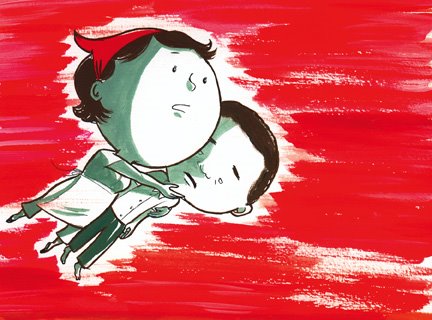
I've been having fun with gouache, the medium I've never managed to get right, but thought I'd try it out for a colour piece for the Dear Pablo story I posted earlier. Maybe this would be a nice back cover (I picture the front cover being graphic, and if I do a series of these stories perhaps only the cover colour and title would change, as opposed to having an illustration on the covers pertaining to the story inside -- boring! predictable!).
I like hot reds, pinks and oranges next to greys and dark browns like I used in this piece.

4 comments:
The blood red looks good...but it makes me think something terrible is going to happen!
Also, red makes me hungry!
j.
I love this piece Claudia? I've never tried gouache, but wouldn't mind experimenting with it.
How different is it from using acrylics? It seems like you can get flatter colours with it.
Diana
Hey guys!
J, you're funny feeling both frightened AND hungry! Yeah, I can see the ominousness of the red, like they're in hell or something : P
D, thanks! I find it's like a cross between watercolour and acrylic, but watercolour is thinner and acrylic is plasticky. Gouache is definitely flatter and has a nice chalky feel, and the best part is you can paint light colours overtop of dark colours! Michael's tip is to water it down to the consistency of thick coffee cream, and to make plenty of one colour if you're going to use it on a large space. But playing around with gouache feels good. : )
Great blog you got here. I'd like to read something more about that matter. Thnx for giving that material.
Sexy Lady
Escort services
Post a Comment